Design · Art Direction · Typography · Illustration
Design Team: Mark Gould, Sam Peel, Harry Ingrams
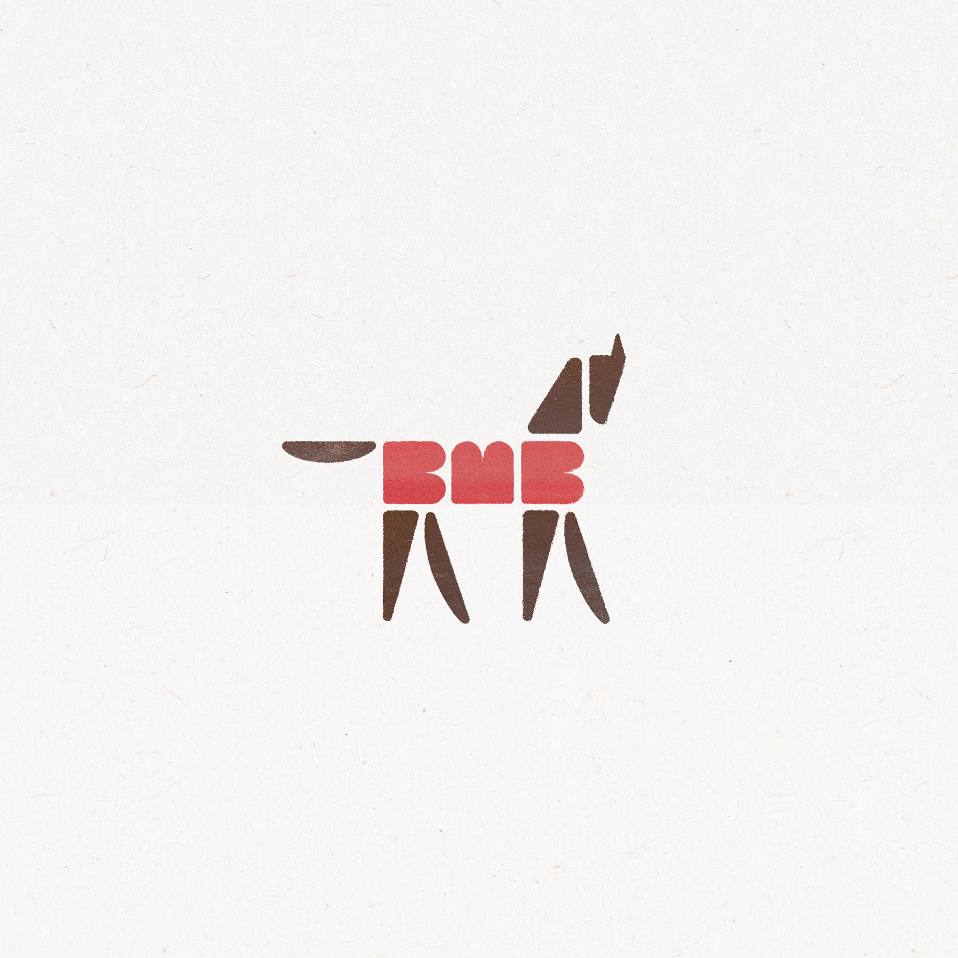
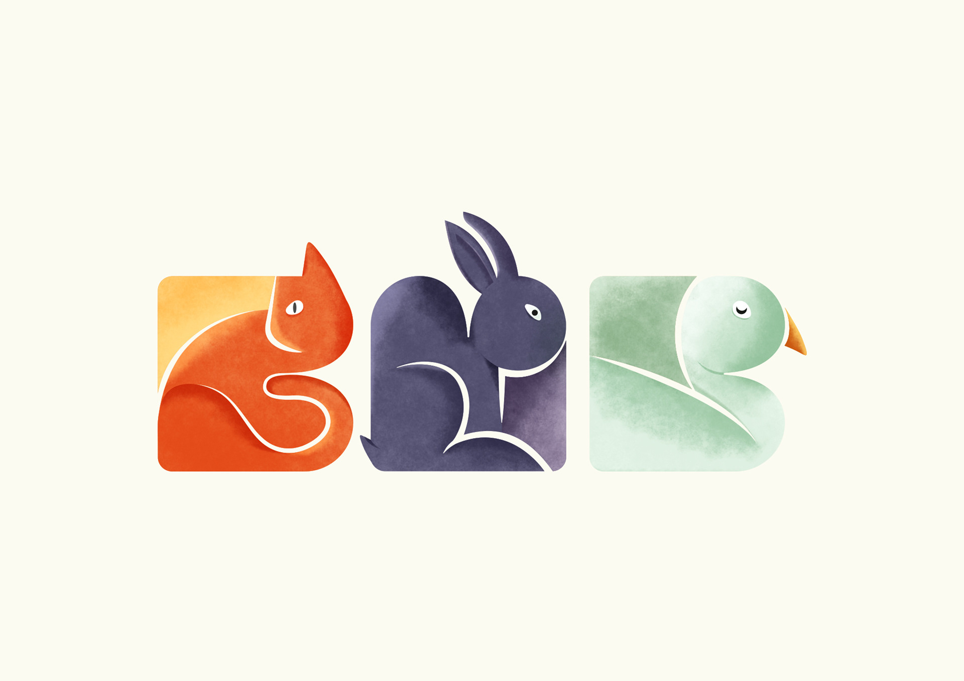
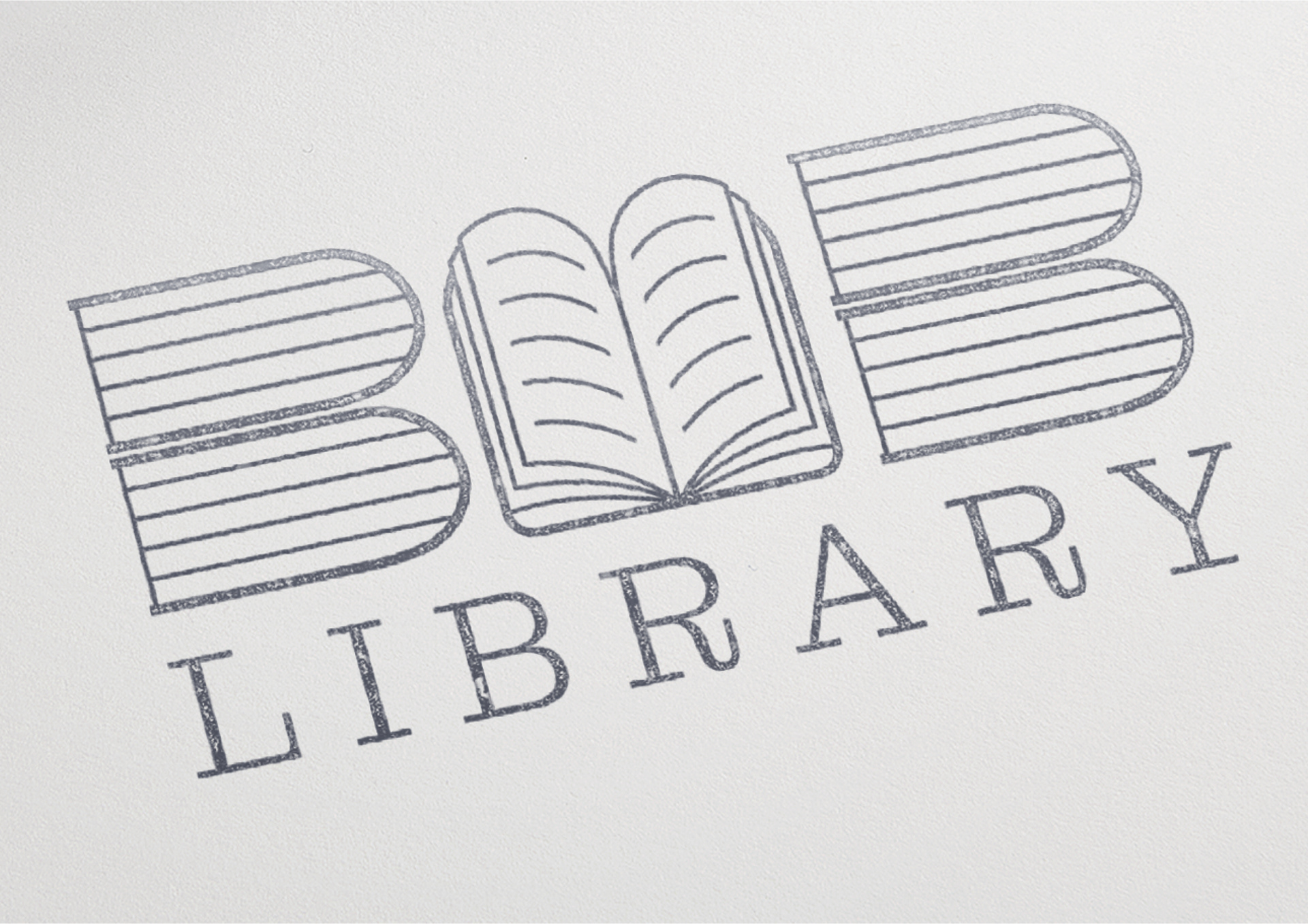
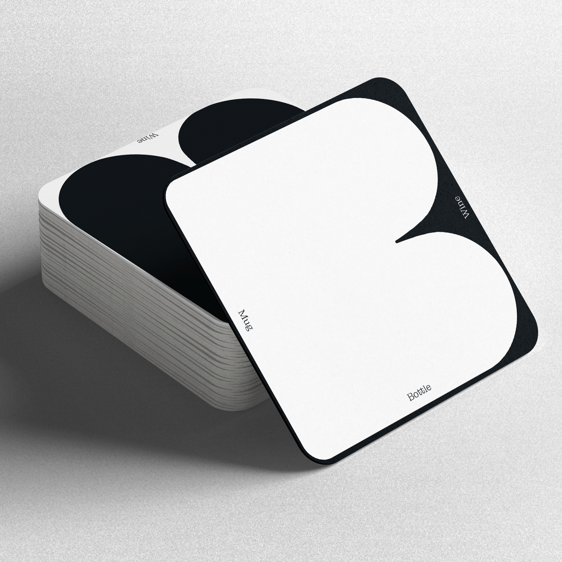
BMB needed a logo that could sit alongside creative work without fighting for attention, but also feel creative in its own right when necessary. One shape repeated three times formed a strong visual relationship between each letter. The solid nature of the shapes and their square proportions created a versatile graphic device that became its own creative platform.
